/

Project Overview
Project goal:
Role - Duration
Platform
Project Type
The Challenge
Starting a habit is easy. Staying consistent is harder.
People often begin new habits with strong intentions. They download an app, create a goal, schedule reminders, and feel motivated to begin.
But motivation alone isn't reliable.
Schedules change. Energy levels fluctuate. Work becomes demanding. A reminder arrives at the wrong time. A workout gets missed. One missed day becomes several, and the routine begins to disappear.
My research suggested that the problem wasn't necessarily a lack of knowledge. Participants often already knew the behaviors they wanted to adopt—exercise more consistently, improve nutrition, quit smoking, or establish healthier routines.
The difficulty was maintaining those behaviors when real life disrupted the plan.
Several themes emerged:
Motivation often follows visible progress rather than creating it.
Disruptions can break routines even when someone genuinely wants to continue.
Too much flexibility can make a habit easier to postpone.
Habits connected to identity or personal meaning can feel more worth maintaining.
Existing tools don't always reflect how inconsistent real-life behavior can be.
This revealed an opportunity to rethink what a habit-building product should support.
Instead of asking:
"How can an app help people track their habits?'
I reframed the problem as:
"How can an app help people keep going when
maintaining the habit becomes difficult?"
Objective / Goal
Design an experience that helps users build momentum, not just track completion.
The goal of Habit Me was to create a supportive habit-building experience that helps users successfully establish a new routine during the critical early stages of behavior change.
Rather than measuring success only through perfect streaks, the product needed to help users understand why a habit mattered to them, create a routine that fit their life, recognize their progress, and recover when things didn’t go according to plan.
The experience was designed around four core goals:
Make habits personally meaningful
Connect each habit to the user’s underlying motivation so the experience represents more than a checklist of completed tasks.
Create enough structure to encourage consistency
Give users clear schedules, reminders, and expectations without making the experience unnecessarily rigid.
Make progress visible
Use progress indicators, streaks, and completion history to reinforce momentum and help users recognize the results of their effort.
Support recovery after disruption
Design for missed days and changing routines instead of assuming users will follow their plans perfectly.
Ultimately, Habit Me wasn’t designed to make users dependent on another productivity tool.
It was designed to help them reach the point where a new behavior begins to feel like part of their routine.


Competitive Analysis
Habit trackers are good at recording behavior. They are less effective at helping users recover when behavior breaks down.
I explored existing habit-building products to understand how they supported goal creation, reminders, streaks, progress tracking, and motivation.
How most habit apps work
1. Create a habit
Define what you want to build.
2. Select frequency
Choose how often you’ll do it.
3. Receive reminders
Get notified to keep you on track.
4. Mark it complete
Log the habit when it’s done.
5. Maintain a streak
Build momentum and keep your streak alive.
This model works well when the user is already consistent.
Apps I looked for references

Key Finding
The larger opportunity appeared when the user stopped being consistent.
Many products emphasized completion and streak maintenance, but offered limited support for the moments when a routine was interrupted.
Missing a habit could quickly feel like losing progress rather than simply experiencing a normal disruption.
Opportunities for Habit Me
More meaningful goal creation — Allow users to connect a habit to the personal reason they want to build it.
Flexible but intentional reminders — Support the user’s routine rather than simply send generic notifications.
Progress beyond perfect streaks — Recognize effort and improvement even when a streak is interrupted.
Support for restarting — A missed day should not feel like the end of the habit.
User Research
People rarely struggle because they don't know what they want to change.
The survey and interviews revealed that participants often had very clear goals.
They wanted to exercise more consistently, eat better, gain or lose weight, quit smoking, create healthier routines, or become more intentional with their time.
The challenge appeared between intention and repetition.
Participants described routines being interrupted by work schedules, low energy, changing priorities, travel, stress, and everyday responsibilities.
This meant the product could not simply rely on motivation to keep users engaged.
It needed to help users create a structure that could survive imperfect days.
Key Research Findings
What people needed when habit-building became difficult
01 — Motivation often follows progress
Participants commonly described feeling more motivated once they could see that their effort was producing results. This suggested that Habit Me should make progress visible early, rather than expecting users to stay motivated long enough for results to become obvious on their own.
Design implication
Use progress indicators, completion history, and streaks to reinforce momentum.
02 — Disruption is more dangerous than lack of knowledge
Participants generally understood the behaviors required to achieve their goals. What caused routines to break was often something external: a busy workday, fatigue, schedule changes, stress, or simply forgetting.
Design implication
Habit Me needed to support users when their routine changed—not just when everything went according to plan.
03 — Too much flexibility can reduce accountability
While flexibility can make a product feel supportive, completely open-ended habits can also become easier to postpone. Participants benefited from having some form of structure around when and how often a habit should occur.
Design implication
Allow users to customize frequency and reminders while still encouraging a clear routine.
How Might We Statements
POV 01 — Cori / Disruption
How might we help users stay consistent when disruptions, changing schedules, or low-energy days interfere with their habits?
FLOW 3 — RECOVER AFTER DISRUPTIONHMW 01 · CONSISTENCY
POV 02 — Josie / Meaning
How might we help users keep their personal reason for building a habit visible and meaningful throughout their journey?
FLOW 1 - START A NEW HABITHMW 02 · MEANING
POV 03 — Shared / Progress
How might we help users recognize early progress so they feel motivated to continue building their habit?
FLOW 2 - TRACK DAILY PROGRESSHMW 03 · MOMENTUM
User Flow

This flow directly addresses the project's central research finding: disruption can break a routine even when motivation to change still exists. Instead of treating inactivity as failure, Habit Me identifies what got in the user's way and provides a relevant path toward adjusting the habit and restarting.
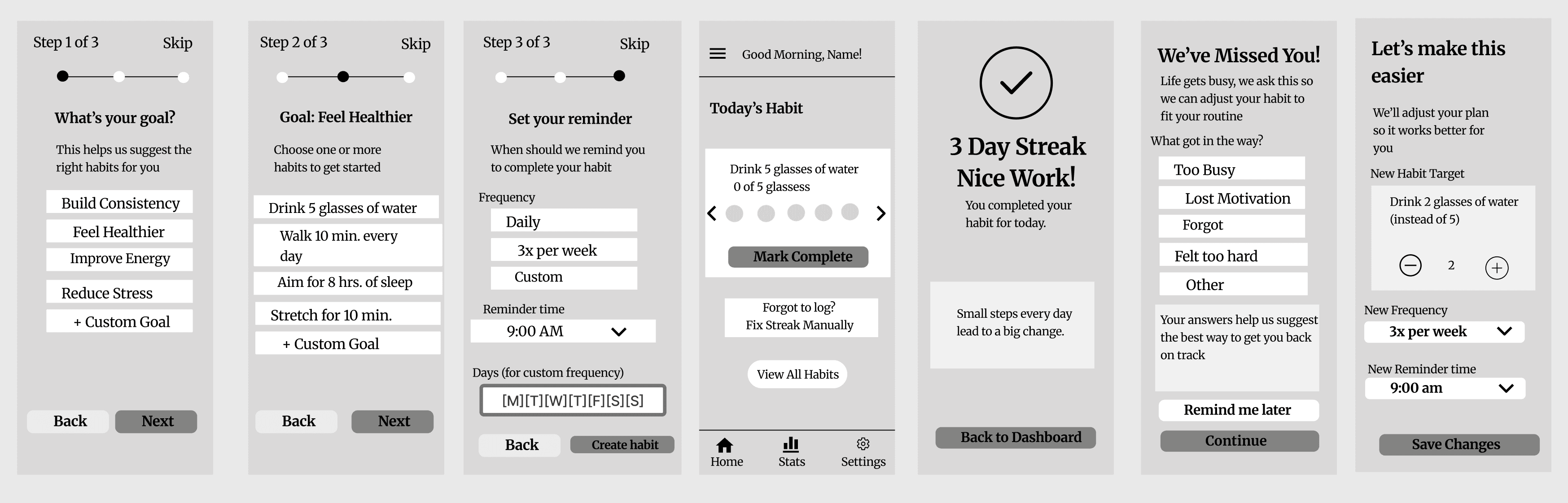
Low-Fidelity Wireframes
Designing the experience before the interface
I began with low-fidelity wireframes to focus on structure, hierarchy, and the core user journey without being distracted by visual styling.
The initial flow centered on three key moments: starting, continuing, and recovering.
Users could define what they wanted to achieve, choose a habit, establish a frequency and reminder, and then track that habit from their dashboard. Progress and streak feedback were incorporated to reinforce consistency once the routine was underway.
I also explored what would happen when consistency broke.
Rather than allowing a missed routine to become a dead end, the recovery flow asks what got in the user’s way and provides an opportunity to adjust the habit’s target, frequency, or reminder time.
This helped translate one of the central research findings into the product experience:
Habit Me needed to support the imperfect moments of habit building—not only successful ones.
01 — Make starting feel personal
Research learning:
Meaning makes habits more resilient.
Adjustment:
Instead of immediately asking users to create a habit, the setup begins by asking about their broader goal and then recommends habits that support it.
Where: Screens 1–2.
02 — Add structure without removing flexibility
Research learning:
Too much flexibility can reduce accountability.
Adjustment:
I introduced frequency, reminder time, and custom scheduling during setup so users could create a clear routine while still adapting it to their lives.
Where: Screen 3.
03 — Make progress visible early
Research learning:
Motivation often follows visible progress.
Adjustment:
I introduced daily completion feedback and streak recognition so users could see evidence of progress during the early stages of habit formation.
Where: Screens 4–5.
04 — Design for recovery, not perfection
Research learning:
Disruption is more dangerous than lack of knowledge.
Adjustment:
Instead of treating inactivity as failure, I explored a recovery experience that asks what interrupted the routine and helps users adjust their habit target, frequency, or reminder.
Where: Screens 6–7.
Branding & Visual Direction
Making consistency feel encouraging, not clinical
Once the experience was established, I developed a visual identity that could make habit building feel approachable, optimistic, and motivating.
The Habit Me brand uses a warm orange as its primary accent, paired with soft neutral backgrounds, bold typography, rounded components, and simple iconography.
Orange became an intentional part of the experience—drawing attention to important actions, selected states, progress, and moments of accomplishment while creating a sense of energy throughout the product.
The visual system was guided by three principles:
Encouraging
The interface should celebrate progress without making users feel punished when they fall behind.
Approachable
Soft surfaces, rounded components, and clear language make the experience feel supportive rather than demanding.
Focused
Strong hierarchy, restrained color usage, and recognizable interaction patterns keep attention on the user’s habits and progress.
The resulting identity helped position Habit Me as more than a productivity tracker. It became a supportive space designed around gradual, sustainable progress.
Habit Me identity system
Habit Me
Bold, friendly typography creates confidence without feeling clinical.
Warm momentum
A warm orange accent gives important actions and progress moments a clear pulse.
Soft structure
Rounded controls and simplified iconography keep attention on habits, not interface mechanics.
Encouraging
Celebrate progress without making people feel punished when they fall behind.
Approachable
Soft surfaces, rounded components, and clear language make support feel human.
Focused
Strong hierarchy and restrained color keep attention on each habit and its progress.
High-Fidelity Design
Turning the strategy into a complete habit-building experience
The high-fidelity designs brought the research, interaction strategy, and visual system together into a cohesive mobile experience.
The onboarding experience was refined into a guided sequence where users first identify their larger goal, select habits that support it, and then establish when those habits should become part of their routine.
Rather than immediately asking users to create a task, the experience begins with “What’s your main goal?”—connecting habit creation back to personal motivation.
Once inside the product, the dashboard gives users an immediate snapshot of what matters today: their habits, completion status, current streak, and motivational reinforcement. Progress was also expanded beyond a simple completed/not-completed state. Individual habit screens provide daily progress, weekly activity, current streaks, and longest streaks, while the broader Progress experience gives users visibility into completion rates and performance over time.
Throughout the interface, the goal remained the same:
Make progress easy to understand, make consistency rewarding, and make the next step feel achievable. The final experience transformed the original wireframes into a product that feels warmer and more motivating while preserving the structure established through research and early design exploration.
Goal-driven onboarding
Personalized habit selection
Intentional reminders
Visible progress
Streak reinforcement


The outcome
Make progress easy to understand, make consistency rewarding, and make the next step feel achievable.
Key design insight
Habit Me needed to support the imperfect moments of habit building, not only successful ones.
Usability Testing
With the core experience in place, I conducted usability testing to understand how easily users could create a habit, configure reminders, navigate the experience, and make changes to an existing routine.
Rather than testing visual preference alone, I wanted to identify moments where the interface created uncertainty or prevented users from completing an intended action.
Participants were asked to complete key tasks within the Habit Me prototype, including:
Create a new habit
Move through the setup experience and establish a personal habit.
Set a reminder
Choose when and how Habit Me should remind them about their routine.
Review progress
Understand their current habit status, progress, and streak information.
Edit an existing habit
Adjust information after a habit had already been created.
The sessions helped reveal which parts of the experience were already intuitive and which interactions needed additional clarity.
Results
8.8/10
Average Habit Setup Rating
Across participants who provided a numerical rating, habit setup received an average score of approximately 8.8/10.
8.3/10
Average Reminder Clarity
Reminder setup was generally understood, while testing also uncovered opportunities to improve time selection and interaction clarity.
Overall Finding
The core experience was easy for participants to understand, but usability testing revealed that several smaller interactions—particularly reminders, time controls, permissions, and progress communication—needed refinement before the experience felt fully polished.
User Feedback
“The setup feels straightforward.”
Participants were generally able to understand the habit-creation flow and move through setup without significant difficulty.
What this validated:
The overall structure and sequence of habit creation were working.
“Reminder controls could be clearer.”
Testing uncovered friction around reminder setup, including the time field and AM/PM selection.
What this revealed:
Small interaction details could create uncertainty even when the overall flow was understood.
“Progress should tell me more.”
Participants responded positively to streak tracking but wanted progress information to communicate more than whether a habit had simply been completed.
What this revealed:
Progress could become a stronger motivational tool if users were given more context around their effort over time.
What Changed After Testing
Testing didn’t change the core concept, it helped refine the experience.
The usability sessions validated the overall Habit Me flow while revealing smaller points of friction that could become frustrating during repeated use.
I used those findings to prioritize several improvements.
01 — Simplified Habit Setup
Feedback
Users generally understood the setup process, but some interactions required additional clarity.
Design response
I refined the onboarding experience into clearer, focused decisions: choose a primary goal, select relevant habits, and establish when those habits should occur.
Result
The final experience reduces cognitive load while keeping the user’s larger motivation connected to habit creation.
02 — Improved Reminder Clarity
Feedback
Testing exposed usability issues around reminder time selection and AM/PM controls.
Design response
Reminder configuration was redesigned with clearer time, day, and scheduling controls and more explicit confirmation of when the user would receive a reminder.
Result
Users can better understand the routine they’re creating before committing to it.
03 — Made Progress More Descriptive
Feedback
Participants responded positively to streaks but wanted clearer information about their overall progress.
Design response
The final designs expanded progress beyond a single streak number by introducing daily progress, weekly activity, completion rates, current streaks, longest streaks, and individual habit insights.
Result
Progress becomes a source of feedback and motivation rather than simply a record of completed tasks.
04 — Strengthened Interaction Clarity
Feedback
Testing revealed smaller usability issues including unclear tap areas, permission messaging, and interaction states.
Design response
I strengthened hierarchy, enlarged important interaction areas, introduced clearer selected and completed states, and refined supporting language throughout the experience.
Result
The interface provides stronger feedback about what can be selected, what has already happened, and what users should do next.